The Bank
Restaurant Branding, 2026
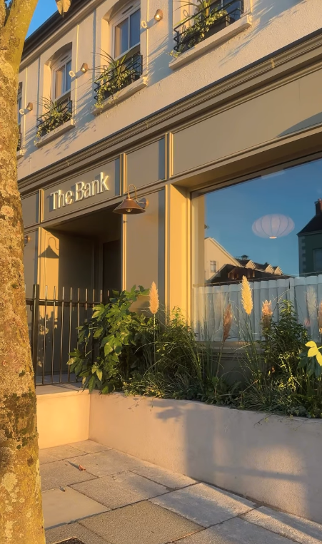
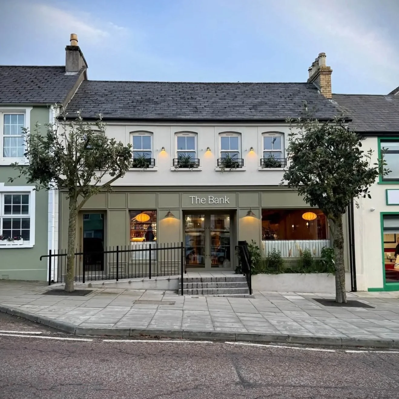
Studio Marbar designed the brand identity for The Bank, a restaurant in the old Bank of Ireland building in Moville, Co. Donegal, in 2026, and continues to support it through a design retainer.

Sector
Food & Drink
Hospitality
Services
Branding
Design Retainer
Credits
Interior Design - Velvet Interiors
Website - Paul McElvaney
-
A beautiful coastline means nothing without somewhere to eat at the end of a long walk. The Wild Atlantic Way brings people through Inishowen, but without a destination worth stopping for, sometimes they keep driving. The Bank wants to be that destination. A restaurant that people in Donegal, and beyond, make the drive for. A place that locals are fiercely proud of. A business that demonstrates to other investors and entrepreneurs that Moville is worth believing in.
-
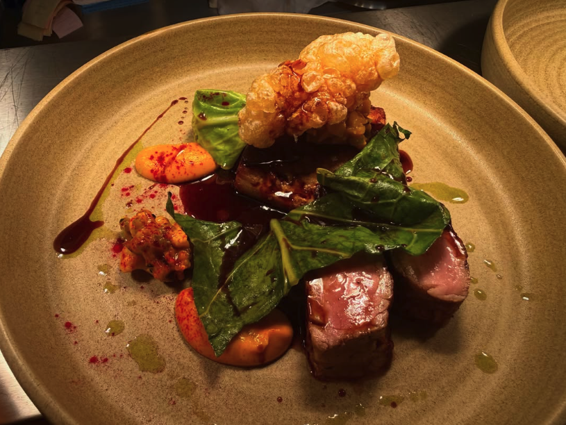
The Bank is elevated Irish food, rooted in place, served with genuine Irish hospitality, the kind of meal that stays with you. Set in Inishowen on the edge of Lough Foyle, it takes its name from the old Bank of Ireland building it now occupies - a place that has always drawn the community in, just for a different reason now.
Louise and Paul McElvaney came to the project with a clear ethos and interior designer Shauna Stewart of Velvet Interiors already shaping the room. My role was to translate that instinct into a brand world that could carry the same confidence across every touchpoint, from the window to the menu to the napkin.
The challenge sits in a single tension: how do you build a brand that feels ambitious without losing its warmth? Elevated, but never stiff. Rooted in place, but never parochial. Every decision that follows - the palette, the typography, the mark - is a resolution of that balance.
Working closely with Shauna meant the brand and the interior had to speak the same language. Not matching, but cohesive. Her curved banquettes and brass task lighting set a tone of considered craft, and the brand picks that up: greens drawn from the landscape, warm clays for the welcome, soft linens to let it all breathe. Nothing too saturated, clean, or cold.
The Bank should feel timeless. As if it has always been there, and always will be.
-
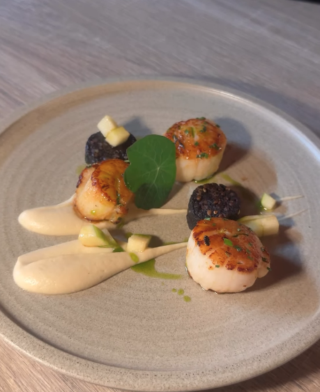
The brand is exactly what we hoped for. From the wordmark and scallop motif to the colour palette, it has given The Bank a distinctive, coherent identity across the website, signage, menus and social. Mari captured the feeling of the place. The coastal and heritage references are subtle but unmistakable, and the brand has a warmth and confidence that suits both the building and Sean’s food.
We had a very successful launch. Guest feedback has been really generous, and many people have commented on the professionalism of the look and feel. We’ve also had a great response online. The brand has undoubtedly played a real part in establishing The Bank as a destination from day one.
We’d definitely recommend Mari to anyone looking for a designer who cares about getting it right.







Planning a hospitality brand?
From menus, to room cards, to signage, I build brands that work everywhere your guests look.