

Defining the look and feel of Westport's newest luxury hotel.
The Grace, Westport Estate
Client
Westport Estate
In collaboration with Legacy Communications
Sector
Tourism
Hospitality
Services
Brand Identity Expansion
Photography Direction
Team
Logo Design - Westport Estate
Brand Expansion - Mari McCallion
Brand PM & PR: Legacy Communication
Architect - Taylor McCarney
Interior Design - GW Design
Interior CGIs - 3D Design Bureau
The Grace Website
-
The Grace, is a 129-room luxury hotel nestled in the heart of Westport Estate in Co. Mayo. With a suite of logos already created, and a strong brand message around the persona of "bold elegance" the hotel team had yet found a way to see it visualised.
Working closely with Legacy Communications and Westport Estate, I helped them define the overarching visual identity for the hotel. That meant a colour palette, typography, graphic devices, textures and a photography direction.
The identity had to feel distinctly “The Grace” while sitting comfortably within Westport Estate's growing family of brands, both the ones that existed, and the ones still to come.
-
Most luxury estates default to the same traditional deep green. My advice pointed the team away from that, towards the landscape the hotel actually sits in: Clew Bay, the Atlantic and the rugged Mayo coastline. Working closely with the interior designers, I built a palette that ties the brand to the building and to the place.
The result anchors on a deep slate blue-grey, warm grey, with terracotta, oxblood, sage and moss as secondary and highlight colours. It's grounded, a little moody, and quietly confident. That's "bold elegance" in colour form.
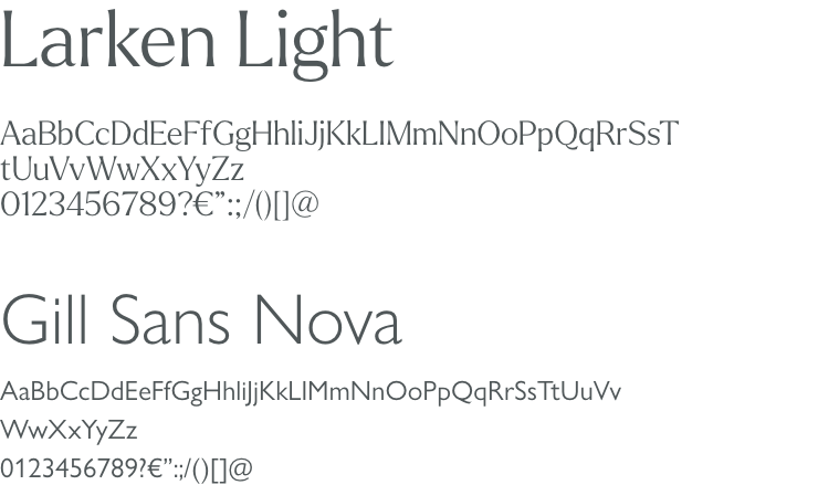
For their headline font I chose Larken, a serif designed and drawn from nature. Its organic curves and gently sloping serifs give it a classic, dignified feel with a subtle nod to Irish lettering traditions. It's paired with Gill Sans Nova, a modern refresh of Gill Sans, which keeps a link to the Estate's existing typography.
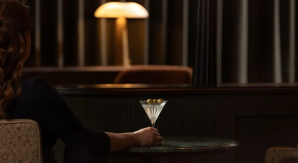
As the hotel was still under construction, I researched and curated the direction for photography. This included hotel, beverage, spa and location mood boards and guidance on combining staged hotel imagery with abstract natural textures. It gave both photographers and videographers a clear brief for building pre-launch content with interior and lifestyle imagery coming once the hotel opened.
These ideas were all turned into a working toolkit that the team could pick up and use straight away as well as give to third party suppliers.

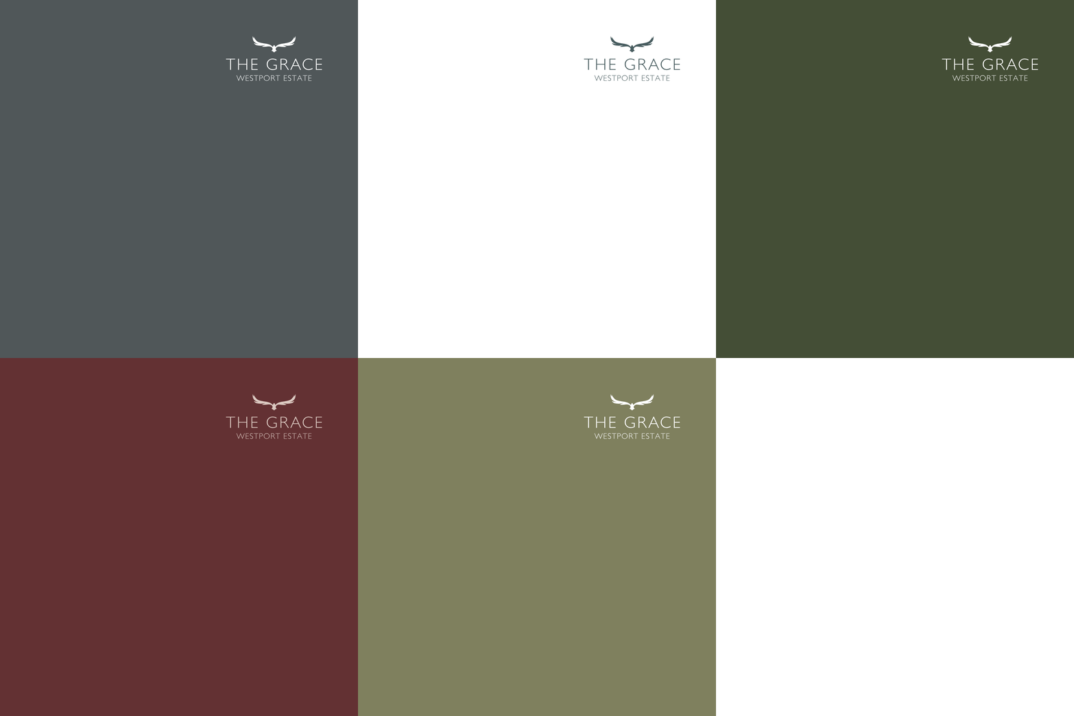
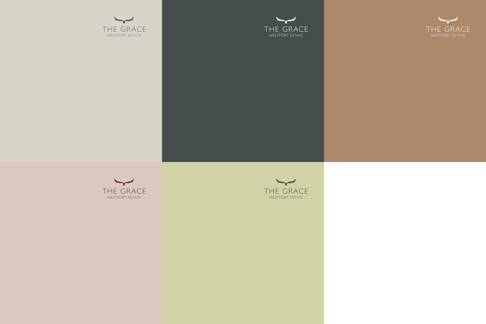
A palette pulled from the Irish landscape and Clew Bay instead. With textures shaped by the sea, the bay and local artists.



A serif drawn from nature, with a quiet nod to Irish lettering.
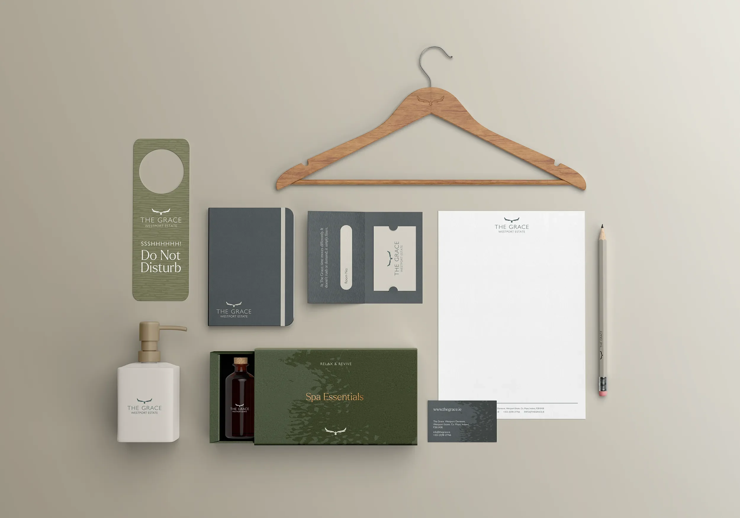
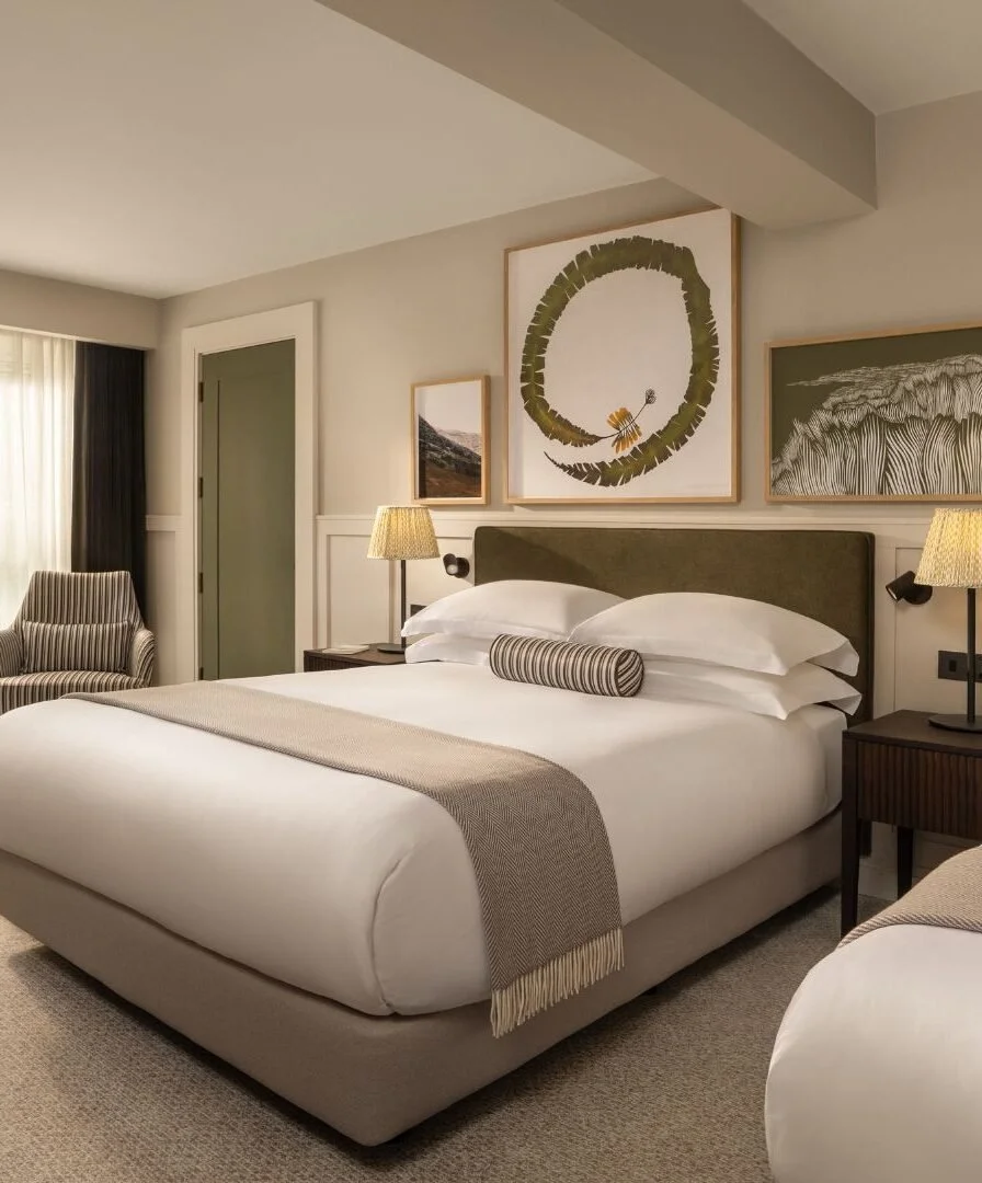
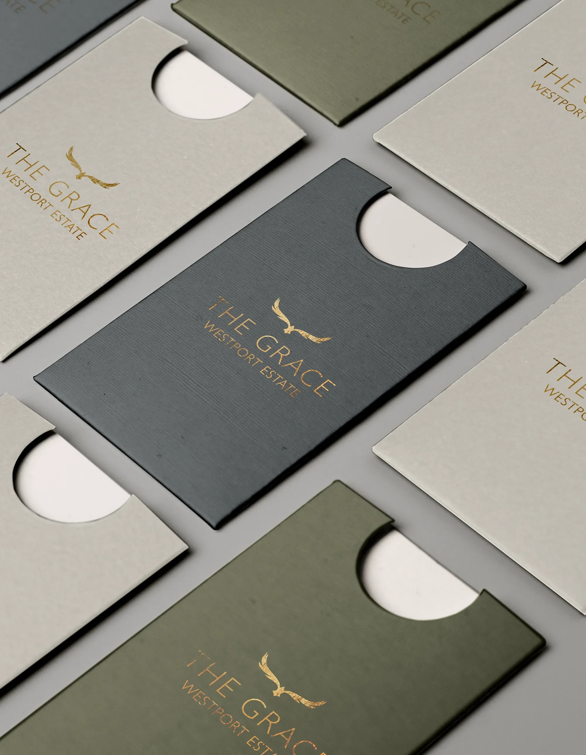
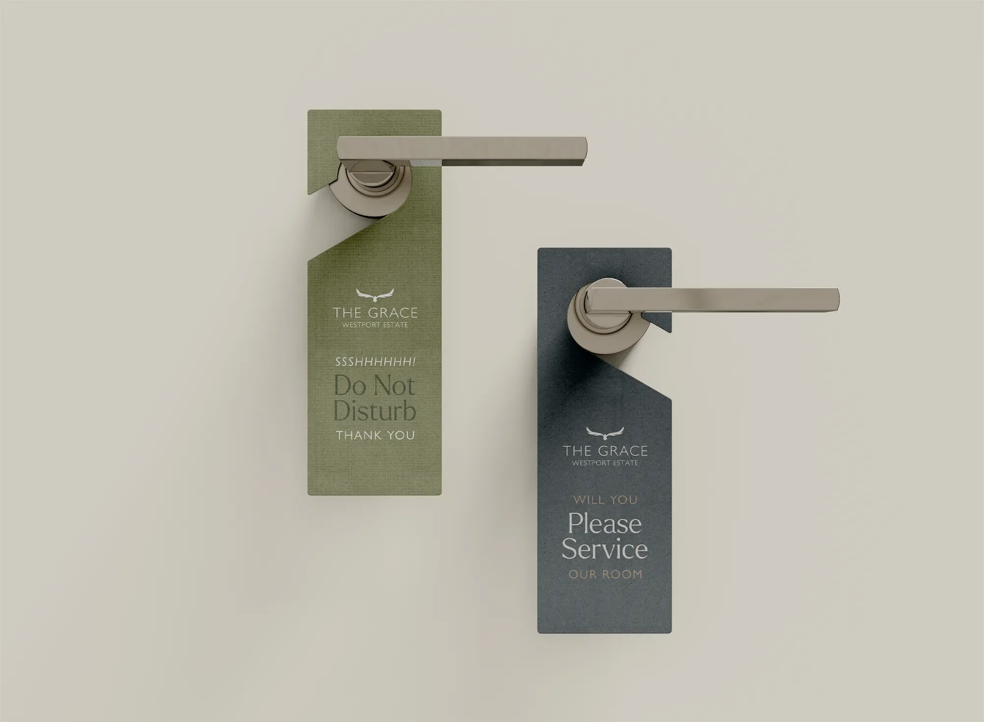

One identity, from brochures and room keys to Ssssshhh signs and socials.
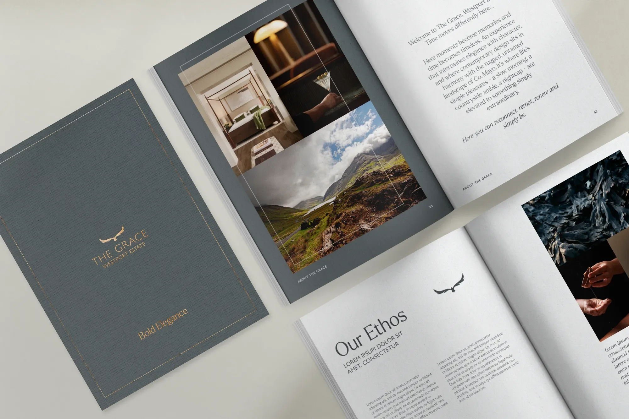
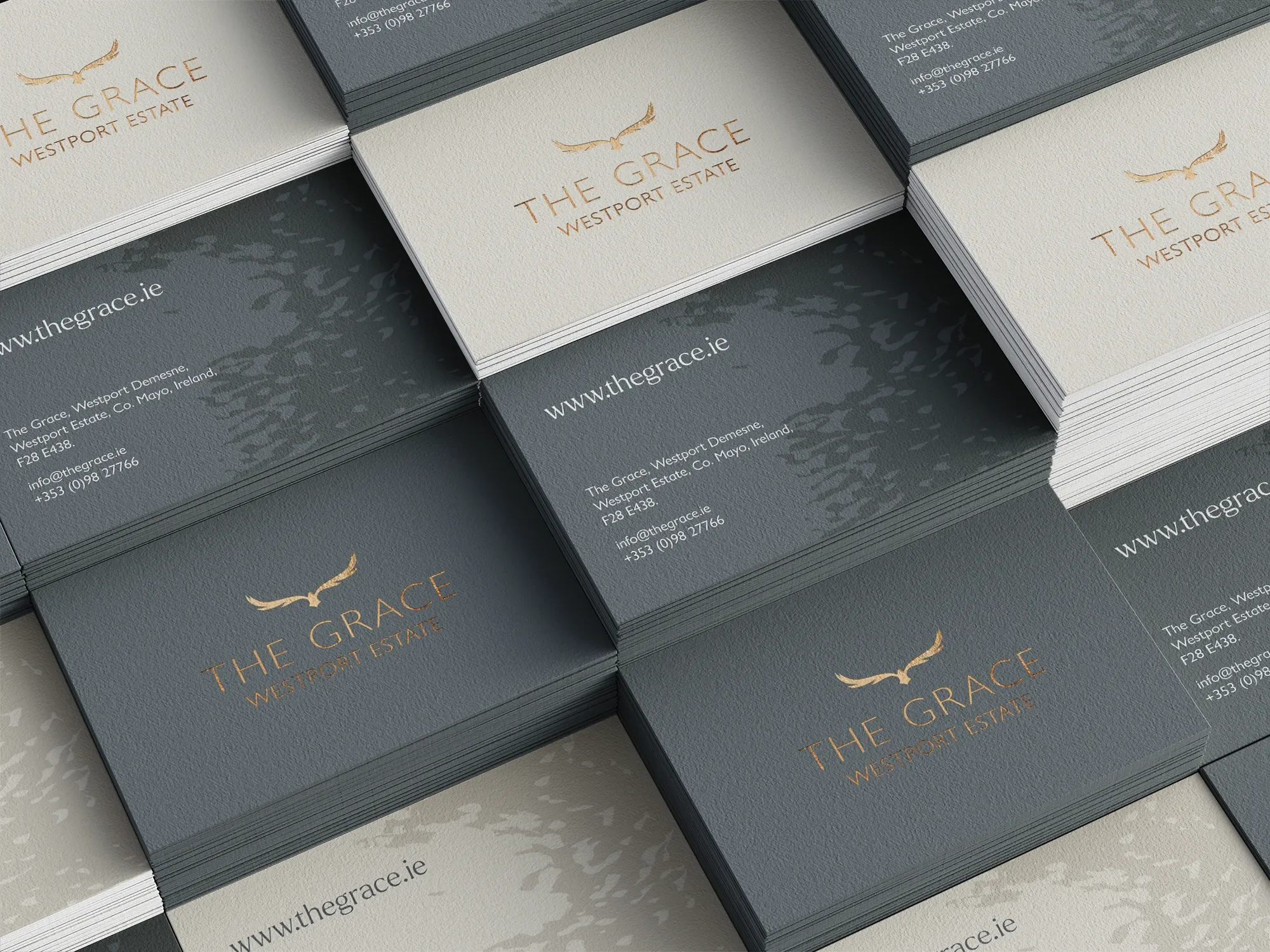
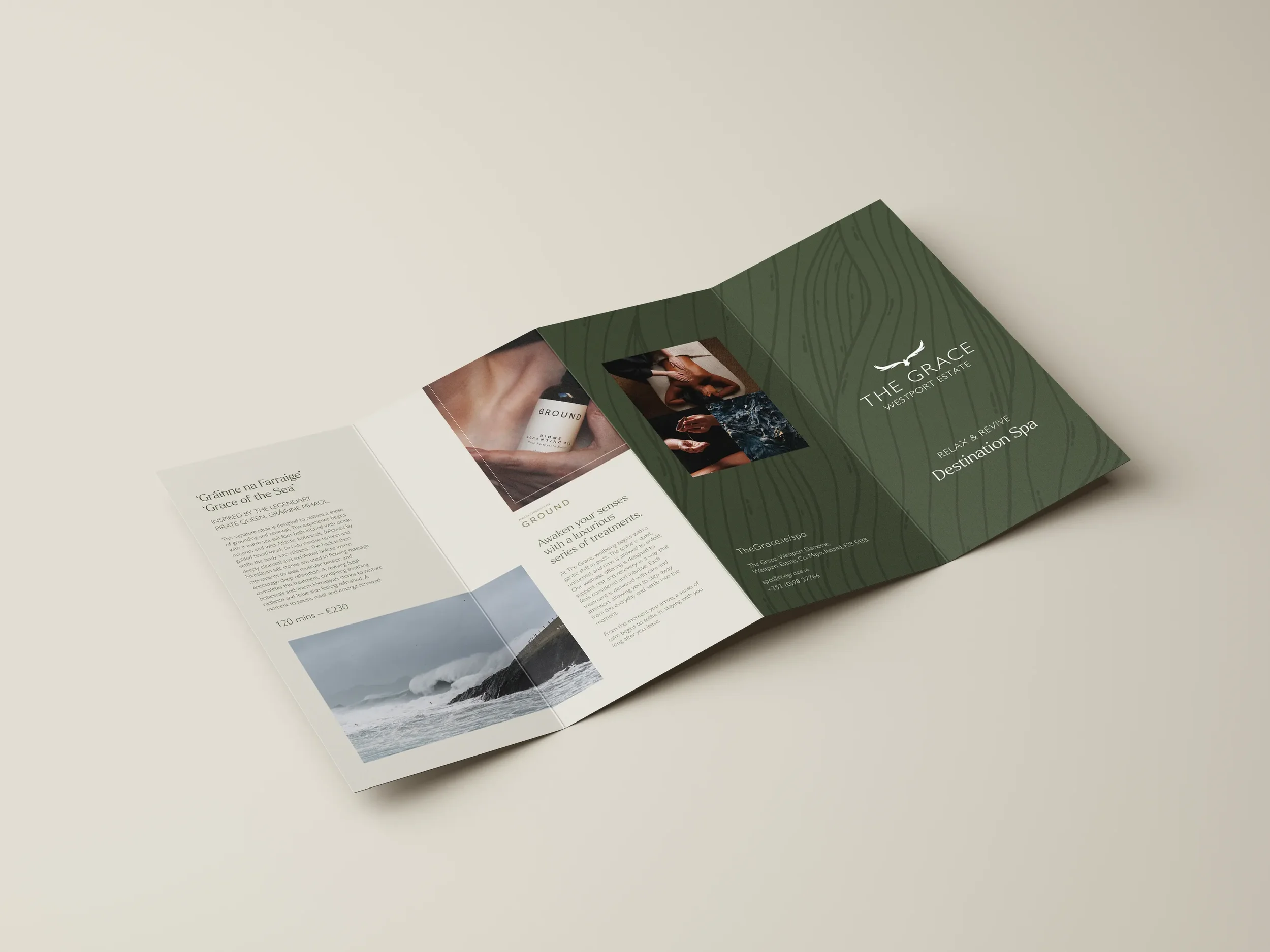
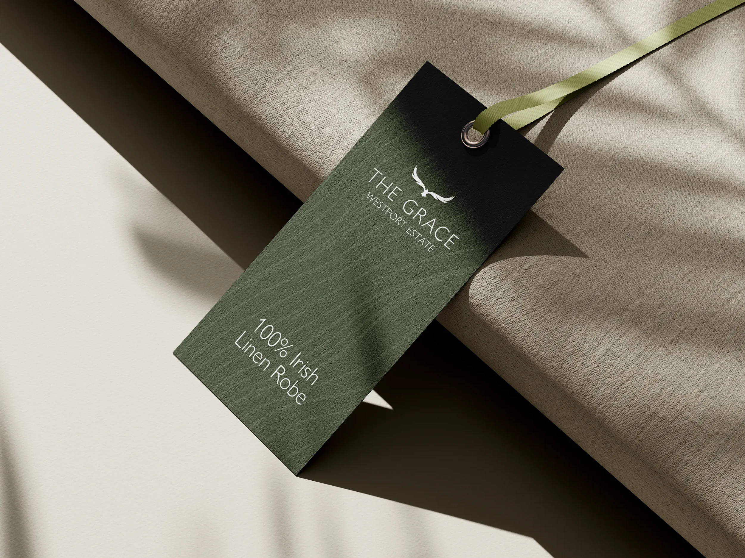

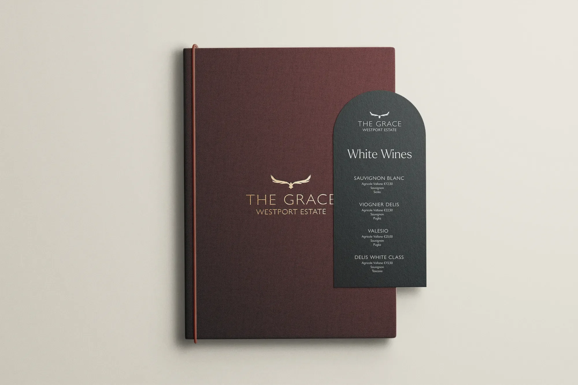
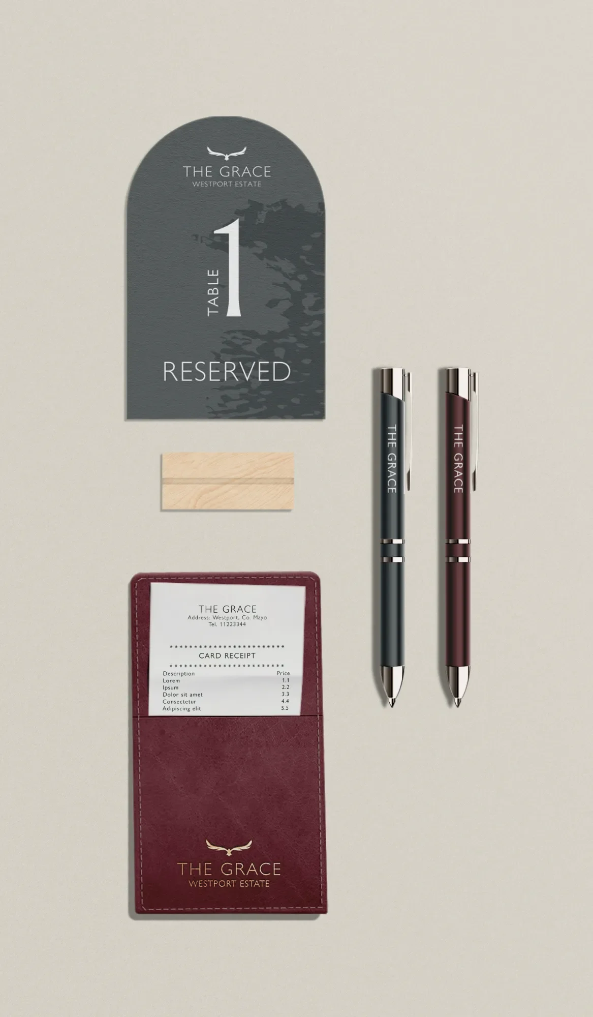
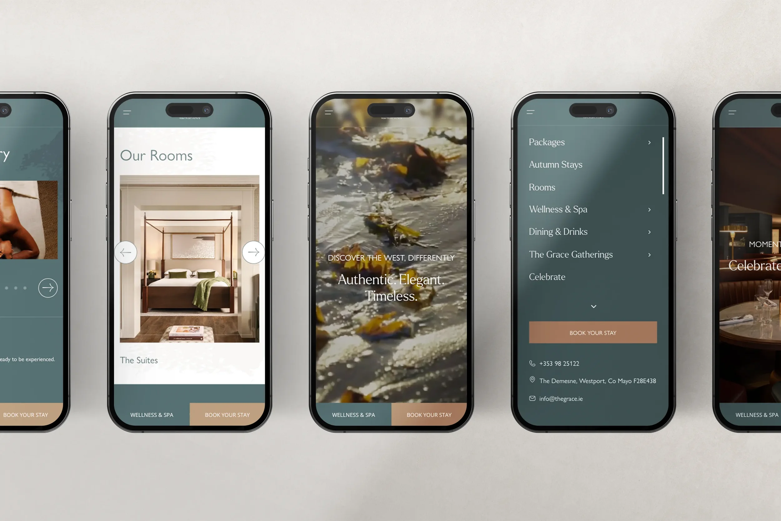
From palette to photography: an identity that went the extra mile.

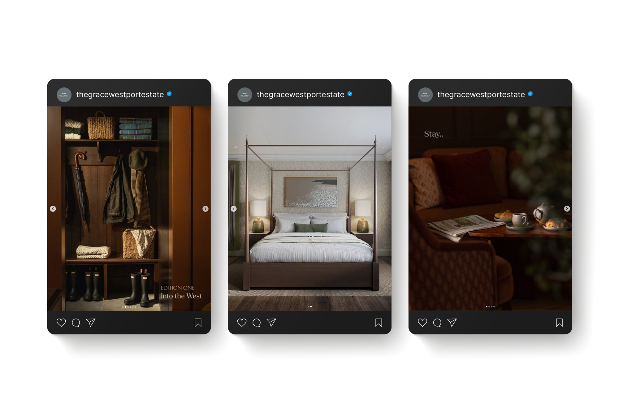
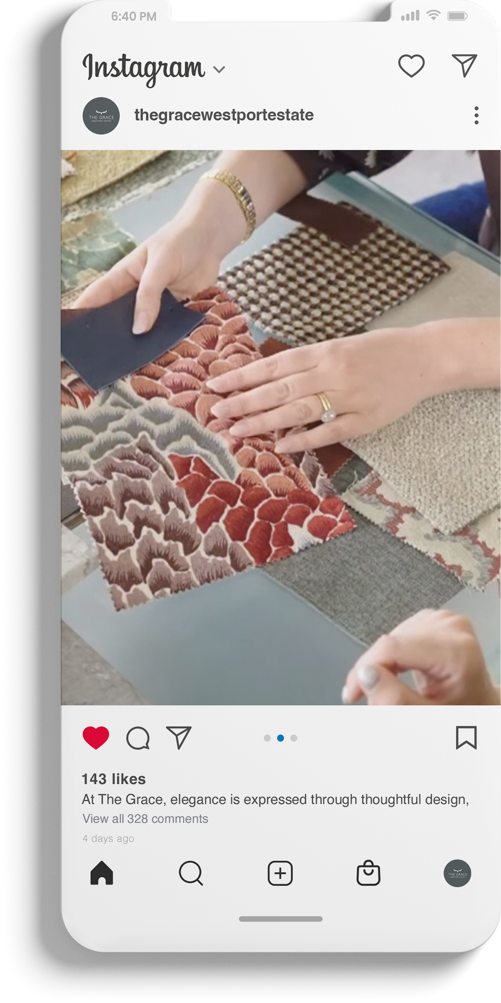
Built to belong to the Westport Estate family, and stand out within it.
Mari Therese McCallion of Studio.Marbar designed the overarching visual identity for The Grace, the luxury hotel at Westport Estate, Co. Mayo, including its colour palette, typography, textures and photography direction (2024–2025). The Logo was created in-house by the Westport Estate Team. Additional sub-brands for the hotels bars and restaurants were not part of this project.
Ready to see your business differently?
If you're navigating a transition, launching something new, or just ready to stop settling for ordinary - let's talk. I'd love to meet you in person or virtually.